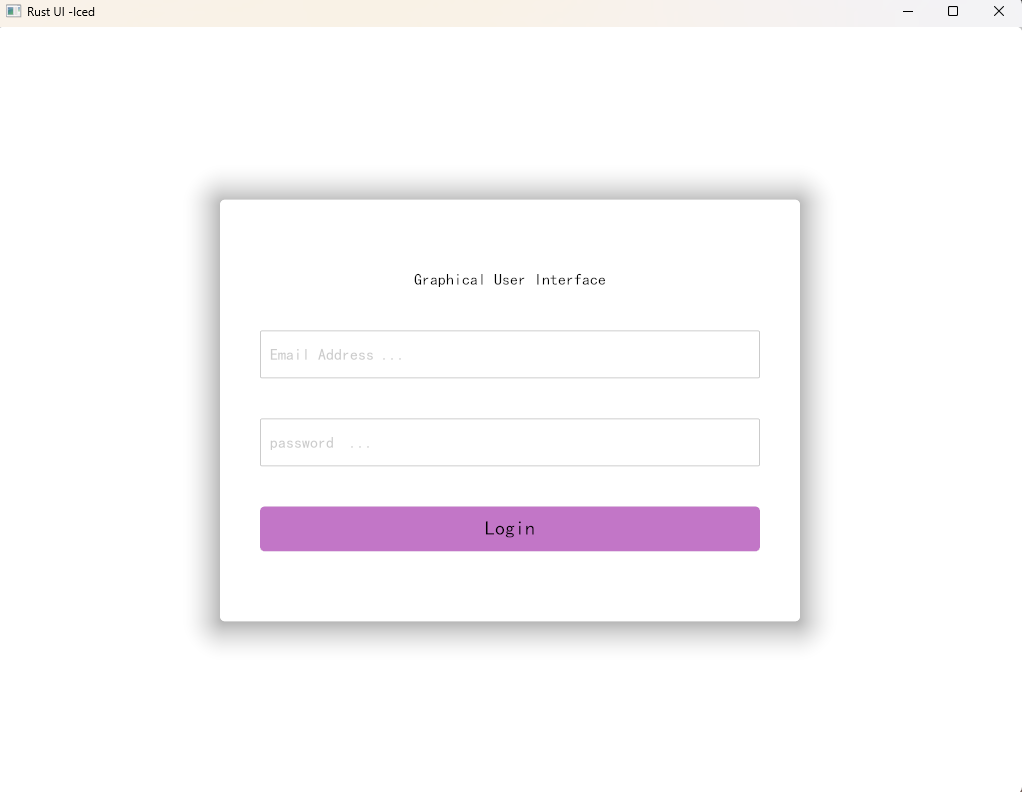
iced 登录界面练习
继续iced rust学习,在B站上看到一个转载youtube的视频,我也跟着写了写。还挺好看的。
// RUST UI - Iced

//modules

#![allow(warnings, unused)]

use iced::{alignment, futures::stream::Concat, widget::{self, button, container, text, Button, Column, Container, Text, TextInput}, Background, Border, Element, Font, Length, Padding, Sandbox, Settings, Shadow, Theme, Vector};

//main entry point ...

pub fn main() -> iced::Result{
    RustUI::run(Settings{
        default_font: Font {
            family: iced::font::Family::Name("楷体"),
            weight: iced::font::Weight::Normal,
            ..Default::default()
        },
        ..Default::default()
    }
    )
}

// define a new strust for RustUI
struct RustUI{
    //define the main variables
    theme: Theme,
    page: Page,
    login_field: LoginField
}

//define a sperate struct for LoginFied
struct LoginField {email:String,password:String}

//define an enum for page => each var insisde Page will create a new view/page...
#[derive(Debug,Clone,PartialEq,Eq)]
enum  Page{Login,Register}

#[derive(Debug,Clone)]
enum Message {
    ToggleTheme, //used to change between light/dark mode
    LoginSubmit,
    Router(String),
    LoginFiedChanged(String,String),
}

impl Sandbox for RustUI {
    type Message = Message;
    fn new() -> Self {
        Self { theme: Theme::Light, page: Page::Login, login_field: LoginField { email: String::new(), password: String::new() } }
    }
    fn title(&self) -> String {
        String::from("Rust UI -Iced")
    }
    fn theme(&self) -> Theme {
        self.theme.clone()
    }
    fn update(&mut self, message: Self::Message) {
        match message {
            Message::ToggleTheme => {}
            Message::LoginFiedChanged(email,password ) =>{}
            Message::LoginSubmit => {}
            Message::Router(route)=> {}
        }
    }

    fn view(&self) -> Element<'_, Self::Message> {
        //Text::new("Pcb的工具箱").into(),
        let content = match self.page{
            Page::Login=>log_in_page(&self.login_field),
            Page::Register =>log_in_page(&self.login_field),
        };

        let wrapper =Column::new()
            .spacing(40)
            .width(Length::Fill)
            .align_items(iced::Alignment::Center)
            .push(content);

        container(wrapper)
            .width(Length::Fill)
            .height(Length::Fill)
            .padding(Padding::from(20))
            .center_x()
            .center_y()
            .style(iced::theme::Container::Custom((Box::new(ContainerStyle))))
            .into()
        //submit_bin("Test Button", Message::ToggleTheme).into()
    }
}

// now we need to setup the different UI componenets


//page footer

//log in page /first page ...
fn log_in_page(LoginField: &LoginField) -> Container<Message>{
    let column=Column::new()
        .push(text("Graphical User Interface"))
        .push(
            input_field("Email Address ...", &LoginField.email)
                        .on_input(|email|{
                            Message::LoginFiedChanged(email, LoginField.password.clone())
                        })
        )
        .push(
            input_field("password  ...", &LoginField.password)
                        .on_input(|password|{
                            Message::LoginFiedChanged( LoginField.email.clone(),password)
                        })
        )
        .push(submit_bin("Login", Message::LoginSubmit))
            .padding(Padding::from([50,20]))
            .align_items(iced::Alignment::Center)
            .spacing(40);
    container(column)
        .padding(Padding::from(20))
        .style(iced::theme::Container::Custom((Box::new(ContainerStyle))))
}
//register page/second page ...


//input field ...
fn input_field(_placeholoder:&str,_vale: &str,)->TextInput<'static, Message>{
    TextInput::new(_placeholoder, _vale)
        .width(Length::Fixed(500.00))
        .padding((Padding::from(10)))
        .line_height(text::LineHeight::Relative(1.75))
}

// sumit button ..
fn submit_bin(name: &str, event: Message)->Button<Message>{
    Button::new(text(name).horizontal_alignment(alignment::Horizontal::Center)
                                    .vertical_alignment(alignment::Vertical::Center)
                                    .size(20)
    ).on_press(event)
    .width(Length::Fixed(500.0))
    .height(Length::Fixed(45.0))
    .style(iced::theme::Button::Custom(Box::new(ButtonStyle::Standard)))


}
// we also need to define a few structs for styling

// define button sytying
enum ButtonStyle {Standard,ThemeButton}
impl button::StyleSheet for ButtonStyle {
    type Style = Theme;

    fn active(&self, theme: &Self::Style) -> button::Appearance {
        button::Appearance{
            background: Some(Background::Color(match self {
                Self::Standard => iced::Color::from_rgb(0.759, 0.463, 0.782),
                Self::ThemeButton => iced::Color::default(),
            })),

            text_color: {
                if  theme == &Theme::Light {
                    match self {
                        Self::Standard => iced::Color::BLACK,
                        Self::ThemeButton => iced::Color::WHITE,
                    }
                } else {
                    match self {
                        Self::Standard => iced::Color::WHITE,
                        Self::ThemeButton =>iced::Color::WHITE,
                    }
                }
            },
            border: match self {
                Self::Standard => Border::with_radius(5),
                Self::ThemeButton => Border::default(),
            },
            shadow: match self {
                Self::Standard => Shadow { color: iced::Color::WHITE, offset: Vector::new(0.0, 4.0), blur_radius: 20.0},
                Self::ThemeButton => Shadow::default(),
            },
            ..Default::default()
        }

    }
}

struct ContainerStyle;
impl  container::StyleSheet for ContainerStyle {
    type Style = Theme;

    fn appearance(&self, Style: &Self::Style) -> container::Appearance {
        container::Appearance { text_color: Default::default(), background: None, border: Border::with_radius(5), shadow: Shadow { color: iced::Color::BLACK, offset: Vector { x: 0.0, y: 2.0 }, blur_radius: 40.0}
    }
}
}